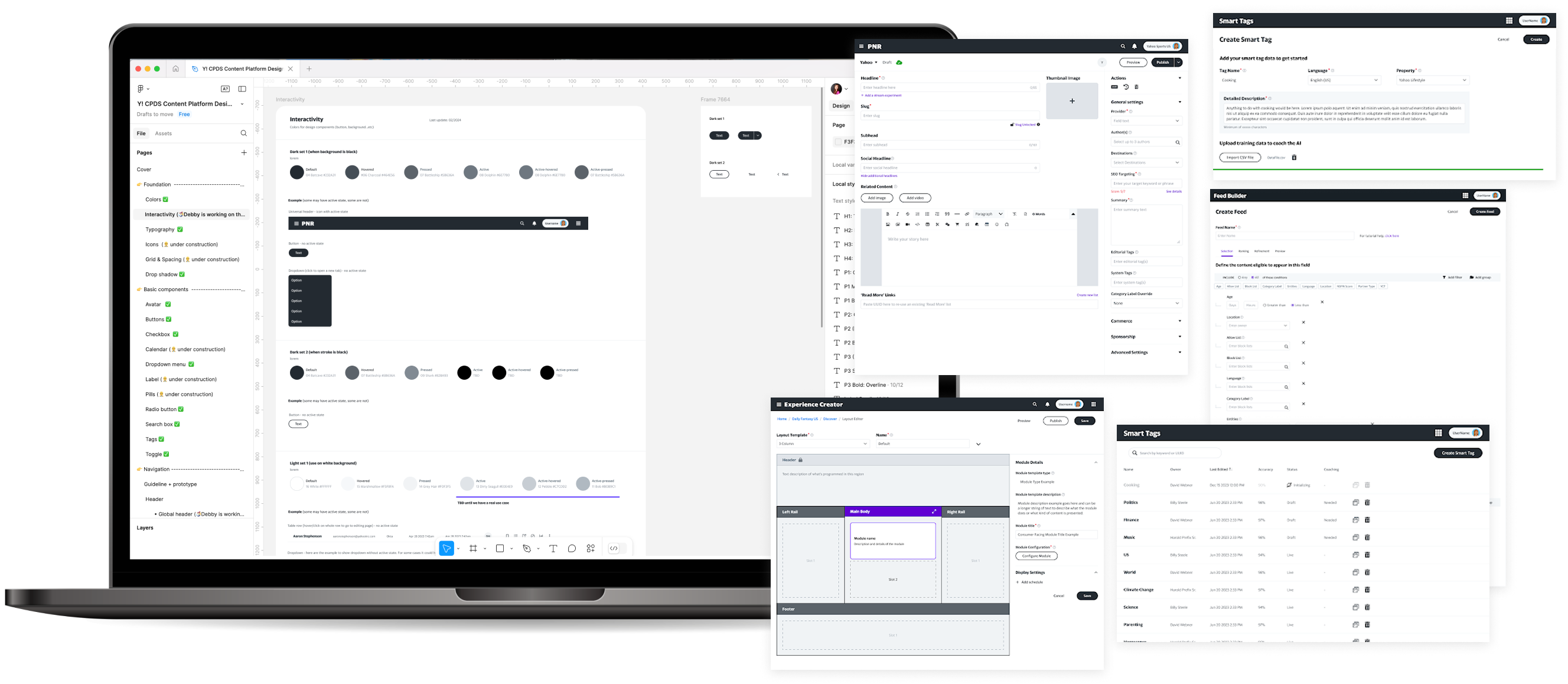
Content Platforms Design System
Led the creation and implementation of a unified platform suite and design system across 10+ content platform tools, modernizing fragmented experience, streamlining workflows, and enabling scalable development
Note: Due to confidentiality agreements, many details are obscured or redacted.
Please feel free to reach out for an in-person walk-through.
| Role | Team | Partners | Timeline |
|---|
| Creative Director & Advocate | 1 Creative Director (me) 3 Product Designers | 10+ Content Platform Products + front & back-end engineers | ≈ 6 months |
ROLE
Creative Director & Advocate
TEAM
1 Creative Director (me)
3 Product Designers
+ front & back-end engineers
Partners
10+ Content Platform Products
TIMELINE
≈ 6 months
The Problems
1. User Experience
Various teams building tools in a vacuum without design oversight led to a fragmented/frankensteined experience across the various content platforms
HMW unify the design & experience so that the user workflows from one platform to another can be more streamlined, productive and intuitive.
2. Resourcing
Historically, not enough/zero design support or product focus on content platform experience
HMW support more tools with the few design resources we have
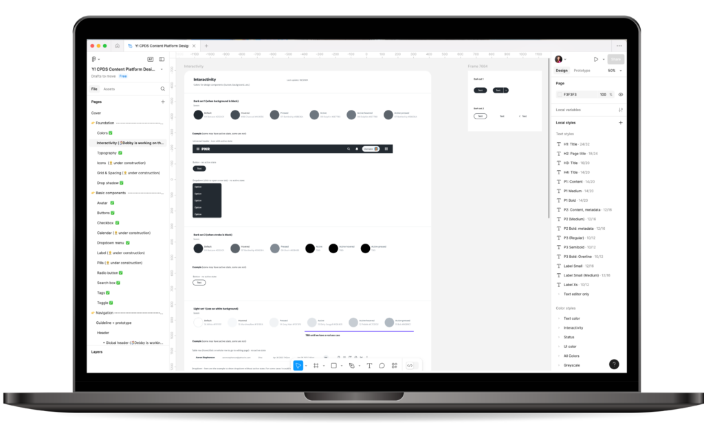
The Solution
A sleek, modern and user-friendly design library & system that can scale and expand across multiple tooling platforms
Design Vision
Create effective & intuitive tools that inspire users
to bring engaging and compelling content to the consumers.
The Mission
To build a unified ecosystem of content platform products where the interconnected information & experiences flow seamlessly from one product to another
(Think ![]()
![]() Ecosystems)
Ecosystems)
The Objective
To enable more efficient and rapid development of features and new products into the various platforms.
By establishing clear guidelines and a design system, this framework will facilitate early conversations and address initial challenges of identifying basic options. We can move faster and more effectively in delivering more features and capabilities for our property partners.
Timeline
Our process began with extensive discussions with various leaders from different parts of the organization to identify and communicate the benefits of a unified design system. Once I gained their support, the design team took about a quarter to develop the design system. They then collaborated with engineers to implement it in Storybook and began integrating it into each tool.

Design Strategy
My roadshow started with design leadership to ensure I had buy-in within my own organization first and then with each of the senior product leaders.
To enhance the chances of approval for resourcing, I divided the enormous endeavor into two phases.
Phase 1 – Minimal CSS Modernization Refresh
Phase 2 – User Test Opportunities & Build Upgrades
Several factors influenced my strategy.
Firstly, I was aware that I had limited engineering resources available to borrow on a part-time basis.
Secondly, I realized the importance of taking swift action to demonstrate an immediate impact. To achieve this, I began with what seemed like a significant upgrade, even though it was a minimal change. This approach would help me gain the best traction for the project.
Research
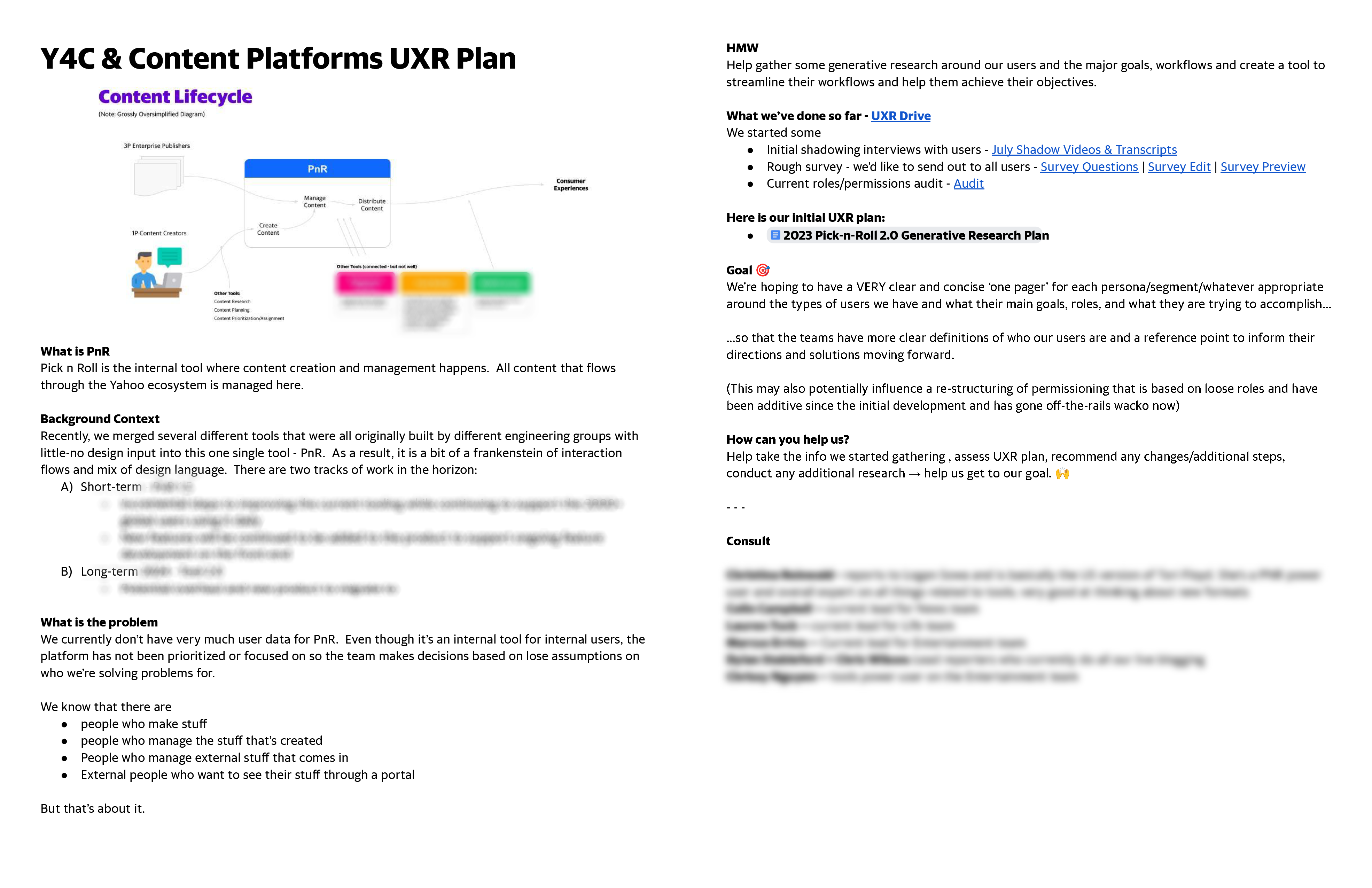
Although the tools had been around for a while, there had been no UX or UXR support in the past. I kicked off a research plan with the designers and later obtained approval to engage third-party UXR partners. This collaboration allowed us to conduct further research and carry out an extensive exploration of our existing platform.
Problems
Some problems that we immediately started to identify included:
- Difficult to Navigate
- Onboarding is lacking and difficult
- Want something easy to use
- Users are unaware of certain functionalities
- Want a simple, modern tool
- Want more automation, less manual processes
- See too many things that I don’t every need/touch – can’t easily find the things I do need
- I have so many work-arounds to do a seamingly simple task
Early Discussions
Prior to the introduction of CPDS, we engaged in numerous discussions with various partners to understand what existing resources were available within Yahoo and whether we could utilize, adapt, or replicate any of them. Ultimately, we discovered that many of the initiatives were still in their early stages or weren’t applicable to our needs. As a result, we decided to stay the course, modifying our existing models and maintaining the efforts we had already made.
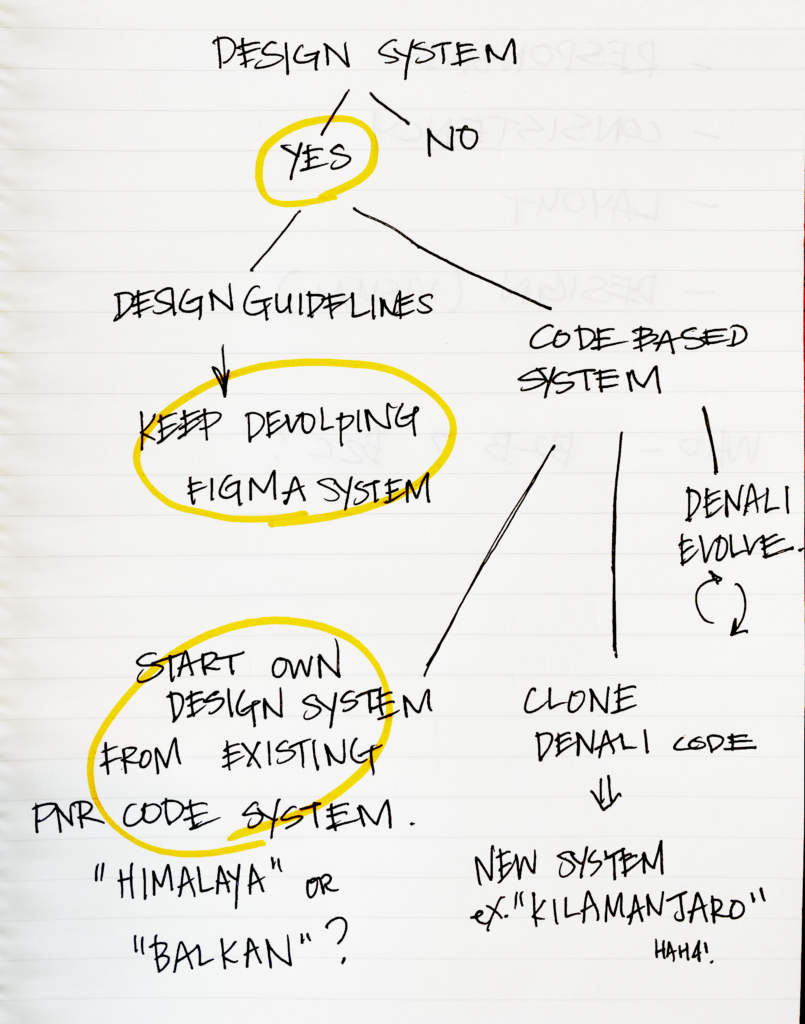
We also had some product discussions around simple ways to start testing the concept of having a unified platform.
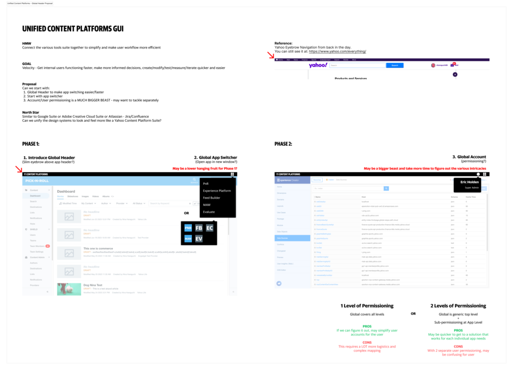
Phase 1
Minimal effort CSS Modernization Refresh
aka Faux Facelift quick win
Modernize
Clean up
Minimal lift
- Color palette updates
- Background, line, border, corner radius updates
- Iconography updates
- Clean up visual inconsistencies
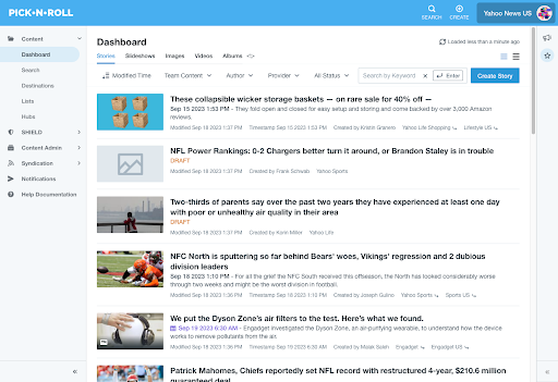
Step 1: We can work with a front-end engineer to make some small tweaks to the existing stylesheet
Step 2: The holistic effort can be folded in with the Storybook development already planned
Before
After
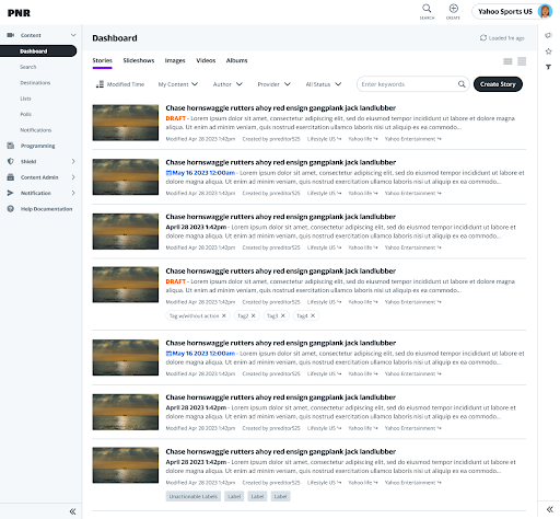
CSS changes only for the content creation flow – still cleans things up and minimizes distractions
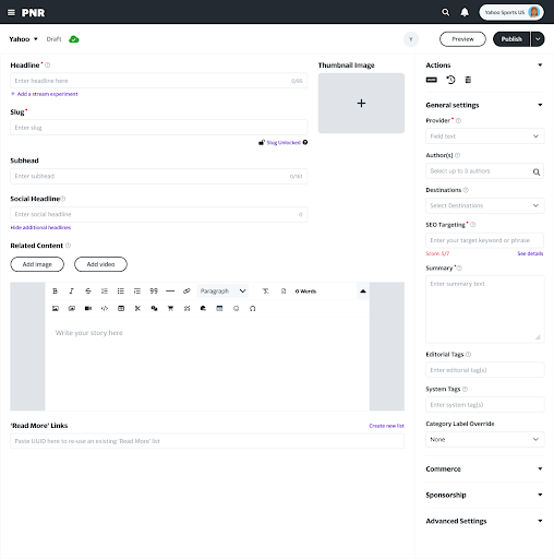
Lots of visual inconsistencies throughout the tool – clean up and minimize

Phase 2
User Test Opportunities & Build Upgrades
We were already in the process of UXR, conducting studies to gather user needs, problems and goals. Next on our list was the start testing out some potential architectural concepts that still work within our existing tooling system to gather some initial feedback. Based on the learnings, we can make a more informed decision on the product direction on whether these changes are better as improvements vs overhaul of the CMS.
We divided this into two parts as well:
- Global core opportunities that were improvements to explore and test
- Exploring new innovative enhancing functions and capabilities
Global Core App Opportunities to Explore
- Navigation, reorganizing functionalities
- Roles and Permissions
- Standardizing interaction models and design system framework
- Notifications and in-tool messaging systems
Navigation, organization, IA cleanup
Goal: Help users navigate, find what they need, and do what they need to do more efficiently.
Also test: Creating a more personalized overview landing dashboard experience that is tailored to the user’s workflow.

Revisit & Simplify Roles and Permissions
Rework and simplify
Redefine an additive permissions structure by roles
-> Show only the features relevant to the roles
+ Read only viewer access

Complete functional hookup of Storybook Library
Standardizing IxD models and the design system framework will be key to be able to be more streamlines and provide a better working model for innersourcing projects in collaboration with the vertical products.

Test workflow architectures and layouts
Do writers want a more ‘writing’ focused workspace?
Or do they want to keep the kitchen sink but maybe with more organization and less clutter?
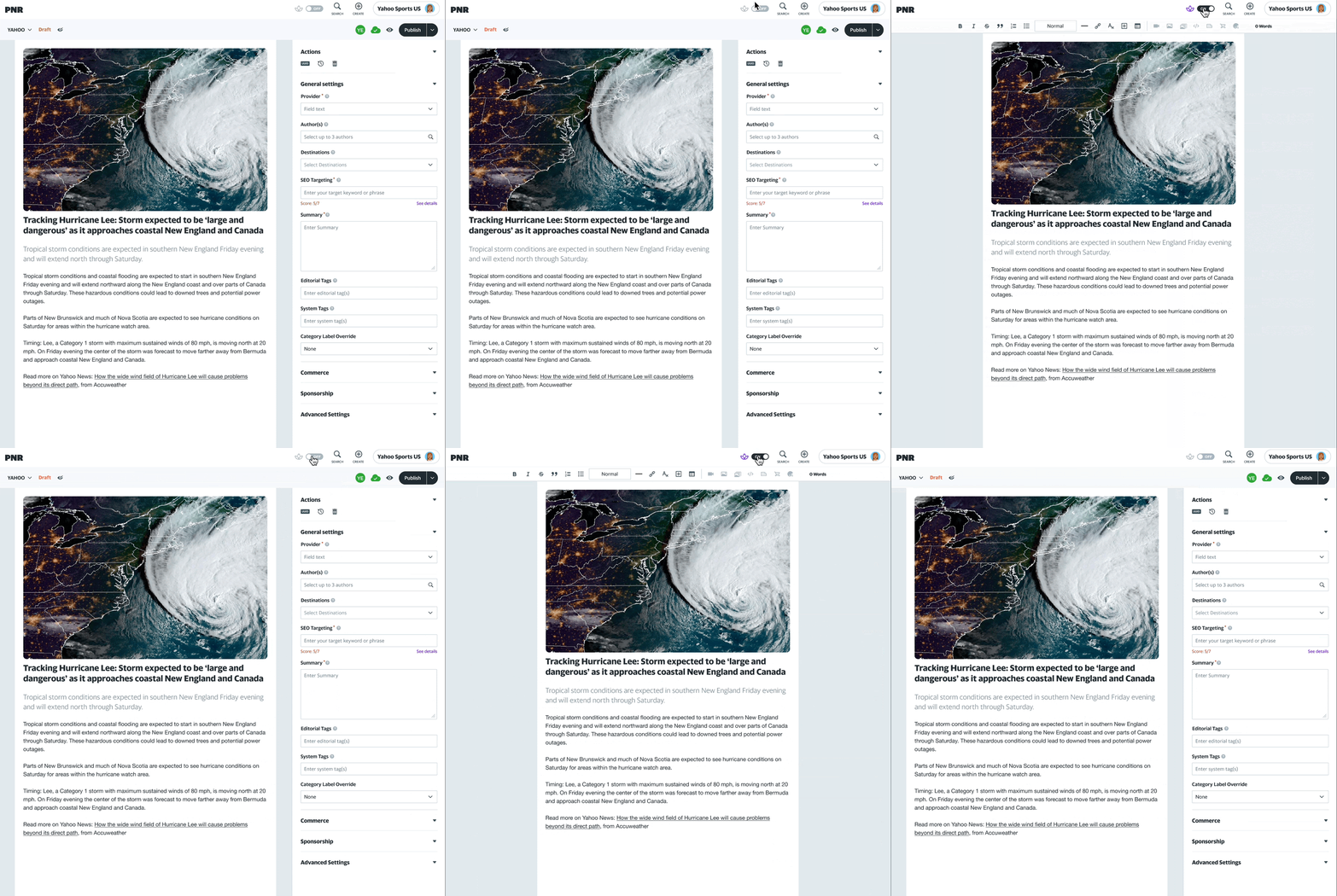
Test New Interaction Models
Test for scalability and whether it can become building blocks for inner sourcing work models and samples.

Test Focused Workspaces
Perhaps users want even more focus
Explore cleaning up unnecessary and rarely used features. Only show the relevant features needed for the role.
E.g. SEO team can have access to all of the SEO related modifiers at their fingertips whereas other editors who never touch them, never see them.

Explore New Functions and Capabilities
Pre-content creation
- Collaboration, Ideation, Planning and Prioritization workflows
- Publisher Dashboards
Content creation
- New formats
- Vertical-specific spaces
Post-content creation
- Integrated metrics and analytics and dashboards
- Programming abilities
- If-this-then-that interactions
- Built-in distribution workflow improvements
5 Year Vision

COFFEE? TEA? LET’S CHAT!
Curious for More?
This overview only scratches the surface.
Let me know if you’d like to explore the deeper strategy, decisions, or outcomes together.

HELLO 👋
Let’s Connect!
Thanks so much for checking out my work.
Feel free to reach out– I’d love to chat, share more, or explore ways we can collaborate!
